More Bad News for Climate Models
But, no matter how you spin it, or where the analysis appears, this fact remains: over the last three decades, the climate model projections offered up thus far, have been, and continue to be, sizable overestimates of reality.
by Patrick J. Michaels
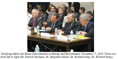
Last fall, I testified before the House Subcommittee on Energy and Environment at a hearing titled “A Rational Discussion of Climate Change: the Science, the Evidence, the Response” (http://gop.science.house.gov/Hearings/Detail.aspx?ID=255). I was on a panel that included Benjamin Santer, Richard Alley, and Richard Feely (from left to right in the photo below).
My testimony had four primary objectives:
1) Demonstrate that the rate of greenhouse-related warming is clearly below the mean of climate forecasts from the United Nations Intergovernmental Panel on Climate Change (IPCC) which are based upon changes in atmospheric carbon dioxide concentrations that are closest to what is actually being observed.
2) Demonstrate that the Finding of Endangerment from greenhouse gases by the Environmental Protection Agency is based upon a very dubious and critical assumption.
3) Demonstrate that the definition of science as a public good induces certain biases that substantially devalue efforts to synthesize science, such as those undertaken by the IPCC and the U.S. Climate Change Science Program (CCSP).
4) Demonstrate that there is substantial discontent with governmental and intergovernmental syntheses of climate change and with policies passed by this House of Representatives.
In this article, I want to discuss work surrounding Objective 1 (for those interested in the other three objectives, my testimony is available here in its entirety).
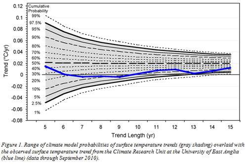
To meet this objective, I undertook an analysis in which I and my colleagues compared the current value of trends in global temperatures that have been observed over the past 5, 6, 7, … 15 years against the distribution of all trends of similar lengths projected by the group of climate models included in the IPCC Fourth Assessment Report.
My findings are summarized in Figure 1, which is the same figure I included in my written testimony and in my oral presentation. It shows that the observed rate of greenhouse-related warming (heavy blue line) is clearly below the mean of climate forecasts from the IPCC (bold dashed line running horizontally through the center of the plot). Additionally, it shows that the observed trends for several lengths are flirting with lower of the two 95% certainty bounds (bold solid black lines which define the upper and lower bounds of the shaded region) of the climate model projections — the range outside of which the observed trends fail to statistically fit into the family of model projections. In other words, the models are verging on failing to contain reality.
The methodology with which we approached this analysis produced such a strong and thorough test of climate model performance, that in the months immediately following my testimony, my colleagues and I formalized our work and submitted it to one of the scientific journals published by the American Geophysical Union (AGU), Geophysical Research Letters. After two rounds of review, our paper was rejected — the primary reason given was that we were too pessimistic in our conclusions about what our results revealed about climate model performance. To me, our results indicated a “cause for concern regarding the consistency between climate model projections and observed climate behavior under conditions of increasing anthropogenic greenhouse-gas emissions.”
However, our reviewers were less concerned. One reviewer, who identified himself to us as Tom Wigley of Climategate fame, suggested that the reason that the models were overpredicting the amount of observed warming was that other factors, which the models had not included (such as the decline in solar output over the past decade and the indirect effect of reflective aerosols), were to blame. Had these other factors been accounted for, there would, in fact, have been no real “cause for concern.” Thus our conclusion was unacceptable.
Our paper never got any further.
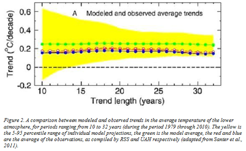
Recently I was alerted to a paper soon-to-be-published in the Journal of Geophysical Research, another publication in the AGU stable. The lead author of this paper is none other than my co-panelist (with the no-longer-secret desire “to beat the crap out” of me) Ben Santer joined by a long list of co-authors, including Tom Wigley. In their paper, Santer and Wigley et al. set out to assess the consistency between observed trends and model projected trends, and they include this rather familiar-looking figure that I include as Figure 2. Apparently, Ben and Tom liked my approach enough to copy it!
Note that Santer and Wigley compare models to satellite-sensed temperatures. There are two versions that they use; “RSS” is the microwave sounding unit data analyzed by Remote Sensing Systems, a California consultancy, and “UAH” is University of Alabama-Huntsville, which has been the primary analysis point of the data since its first publication in 1990.
Despite same striking methodological similarities, there are some key differences.
1) Our analysis examined trends from length 5 to 15 years. Santer’s analysis examined trends from length 10 to 32 years. The reason they could include longer trends than we could, was that we limited our analysis — and this is important — to the period of time in which the climate models were making true projections, which was post-2000. Santer et al. extended the period of record by splicing model hindcasts from 1979-2000 onto model projections from 2001-2010. During the hindcasting period, the folks who developed the various climate models had the observations available to them, and they could thus tinker with the myriad control knobs built into each climate model to insure that the models well-replicated reality. It would seem hardly fair to include this period in a test which is aimed at measuring the consistency between models and observations. After all, who fails a test with the answer key on their desk? But that concern seems to have escaped the reviewers (or was overridden).
2) In our analysis, we examined a period during which there were no volcanic eruptions (which can have a sizeable impact on decadal-scale trends) — either in the models or the observations — so that the recent observed warming (or lack thereof) could be compared, apples-to-apples, with model projections of that warming. In their analysis, Santer et al. included a period of time in which there were two major volcanic eruptions. An influence on these eruptions is to broaden the range of the collection of modeled trends (the yellow area in Figure 2), thereby making the mean of the observed trends (the blue and the red lines) look like they were better enveloped by the model projections. Had Santer et al. examined a period of time free from large volcanic eruptions, then the current lack of warming (which occurred during largely volcano-free conditions) would fall further out on the low tail of model trend projections and the consistency between the observations and the model projections would degrade.
3) In our analysis, we show the value of the current observed trend against the backdrop of the distribution of the collection of individual model trends (Figure 1). This is an apples-to-apples comparison. You can visually gauge the degree to which the current observed trend falls within the population of model projected trends. In their analysis (Figure 2), they plot the mean of a collection of overlapping observed trends of a particular length derived from the period from 1979 through 2010 against a backdrop of the collection of individual model trends. This is not apples-to-apples. And it is thus impossible to judge from this figure the level of correspondence between the observations and the models (although the authors a want you to believe that it is relatively close). In order to make this graphic useful, Santer et al. should have included the distribution of observed trends along with the mean — just as they did for the model output (the yellow area around the green line).
But, even given the problems with the Santer et al. analysis as presented in Figure 2, there is still an interesting message lurking within: at all trends lengths over the past 32 years, the average observed rate of warming falls below the average of the climate model projected rate of warming, and as the trend gets longer, the discrepancy gets worse.
The model average projected trend for the lower atmosphere is about 0.25°C/decade over all time scales (from 1979 through 2010) (green line in Figure 2). The various averages of the observed trends over the different time scales range from about 0.14 to 0.21°C/decade (data from Remote Sensing Systems (RSS), red lines; data from the University of Alabama-Huntsville (UAH), blue line).
To me, this is cause for concern.
And I become even more concerned when I consider the current behavior of the global temperatures (as I did in my paper), rather than the mean behavior over the past 32 years (as examined by Santer et al.). In Figure 3, I took the liberty to plot the current (through August 2011) trend in global temperatures for periods from 10 to 32 years against Santer et al.‘s backdrop of model projections (as I previously mentioned, this is much closer to being apples-to-apples than how Santer et al. originally presented the Figure). The current observed trends are in the bold dashed lines (again, RSS, red; UAH, blue).
Several things of note:
1) At lengths of longer than about 20 years, the current value of the observed trends are very similar to the mean of the collection of overlapping trends of the same length calculated during the period 1979-2010. Bu that during periods less than 20 years, the current value of the observed trend falls beneath the mean value of the observed trend — and indication that the rate of global warming has slowed and the discrepancy with models projections has widened.
2) Even considering that Santer et al.‘s model spread is too wide (as a result of the inclusion of volcanic variability) for the shorter time scales, the RSS observed data set indicates that the current trend of length 14 years is a) negative, and b) outside the 95% range of model projections.
Santer and Wigley attempt to be re-assuring, telling us that, in fact, that there are a litany of reasons why the models predict too much warming:
Possible explanations for these results include the neglect of negative forcings in many of the CMIP-3 simulations of forced climate change …, omission of recent temporal changes in solar and volcanic forcing …, forcing discontinuities at the ‘splice points’ between [model] simulations of 20th and 21st century climate change …, model response errors, residual observational errors …, and an unusual manifestation of natural internal variability in the observations …
One phrase begs for translation: we think “an unusual manifestation of natural internal variability in the observations” means “something that our climate models failed to predict.” And, we might add, what is so “unusual” about the lack of warming for the last fifteen-odd years? The same thing occurred in 1966-75, which means that Santer and Wigley feel their models would have failed then, too. That is, their model would have failed for 30 out of the last 45 years, which makes its reliability questionable.
The funny thing is, is that in our paper, we also listed several reasons for the model/observation discrepancy, including many of these same ones (we also threw in the possibility that model-based climate sensitivity was too large, a possibility that either escaped mentioned by Santer et al., or was buried in their “model response errors”). But alas, our reviewers (including Wigely) would hear none of it.
For a bit of insight on how this happens, consult the Climategate emails, where Santer and Wigley (along with hockey-stick defender Michael Mann) discuss how to remove journal editors that committed the sin of publishing my papers. He who controls the journal, controls the message.
But, no matter how you spin it, or where the analysis appears, this fact remains: over the last three decades, the climate model projections offered up thus far, have been, and continue to be, sizeable overestimates of reality. Give me all the excuses that you want, but if the excuses are indeed real, then obviously they are important drivers of the climate systems and therefore must be considered when offering up future climate projections. Failing to do so, as we have seen, leads to failing forecasts. And until significant improvements are made in the models (improvements that may very well result in a determination of a lower climate sensitivity), I see no compelling reason why we should bank on existing climate model projections for the future state/behavior of the climate.
Reference:
Santer, B.D., et al., 2011. Separating Signal and Noise in Atmospheric Temperature Changes: The Importance of Timescale. Journal of Geophysical Research, in press.
Patrick J. Michaels is a Senior Fellow in Environmental Studies at the Cato Institute.
Help Make A Difference By Sharing These Articles On Facebook, Twitter And Elsewhere:


